Share this
by Alex Bronk on June 29, 2023
As your partner in health, wellbeing, and navigation, we’re committed to helping you reach your program goals. This includes enhancing Reporting Dashboards to better meet your program evaluation and analytics needs.
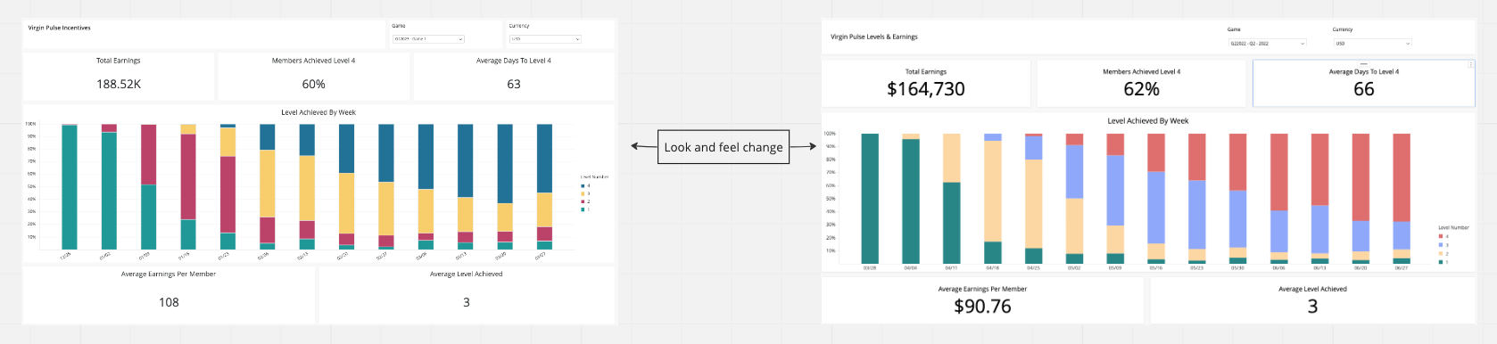
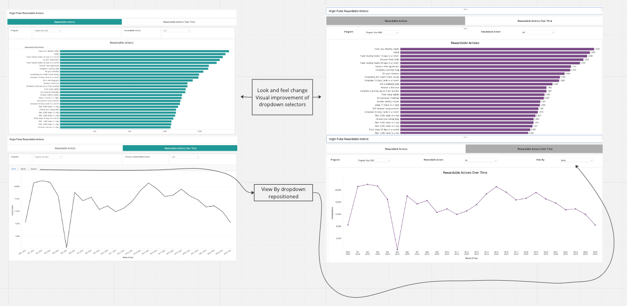
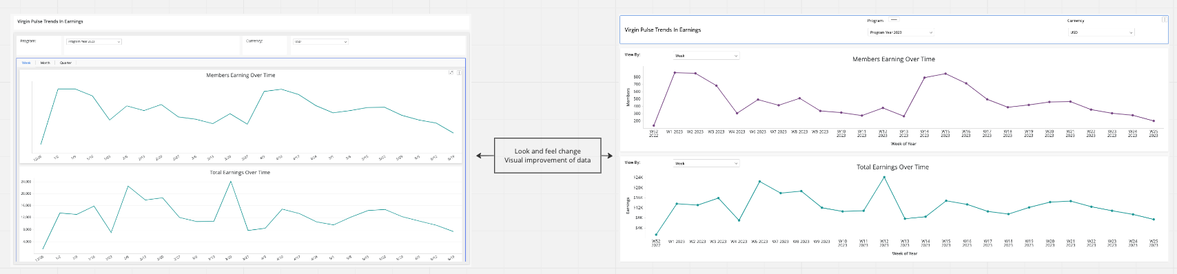
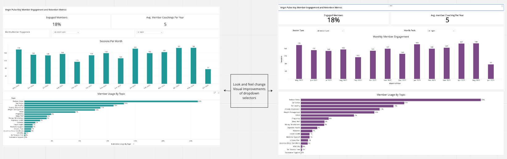
We’ve updated the look and feel of our Reporting Dashboards to optimize the user experience and improve data visualization. Specifically, these enhancements:
- Optimize the dashboards’ functionality
- Improve data visualization to align with the Virgin Pulse branding color palette and allow Users easier access and data interpretation
What’s new?
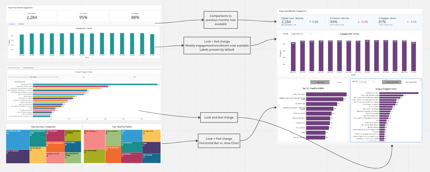
We’ve added new insights and updated the look and feel of our Reporting Dashboards to optimize user experience and improve data visualization.
- New insights
- Month-over-month comparisons on the Engagement & Enrollment KPIs
- Weekly Engagement and Enrollment Trends
- Updated look and feel
- Ability to display Health Risk in a grid view
- View Healthy Habits and Journeys as bar charts rather than an area graph
- Please note that these updates have no effect on current functionality—including access, data, and filtering capabilities
Updates: Before & After
Click the image to view larger
.png)
About Reporting Dashboards
Reporting Dashboards are our self-serve reporting tool dedicated to helping you monitor and measure the impact of your health and wellbeing programs. These reporting tools allow for greater data consolidation and alignment, improved filtering functionality, to improved support for health plan and distributor clients.
For more information on Reporting Dashboards, visit the Client Resource Center (password: VirginPulseCRC!) user guides, metric definitions, and important notes to guide you through the dashboards.
